Dominic White
Service and User Experience Designer
Daly
Interface design
User research
Content design
Front-end development
ReactJS
Figma
Netlify
Storybook
Context
The Co-operative Bank was founded before the telephone was invented.
As such, their digital experience varies - some areas remain unchanged from the global financial crisis of 2008.
Phone applications look and behave differently from web applications, which look and behave differently from sales pages, which look and behave differently from customer service pages.
Adding complexity was the organisation of the bank's digital department - scrum teams are organised by platform, rather than by product. This meant each feature had different implementations and designs across different platforms.
To add time pressure, our hosting provider was cutting us off within months - meaning any new design work had to be done to a very tight timeframe to go live in time for a site migration.
Content, too, was complex. Management of given pages, images, brand guides and regulatory information is distributed across an organisation of around 4000 people.
Problem
How to meet user, regulatory, business and stakeholder needs simultaneously across a site of 600+ pages, a mobile application, 6 scrum teams, 4000 colleagues, 750k active customers and only 3 designers?
Response
Create a design system to allow developers, designers, content executives and managers to create mutually-intelligible services across platforms and products.
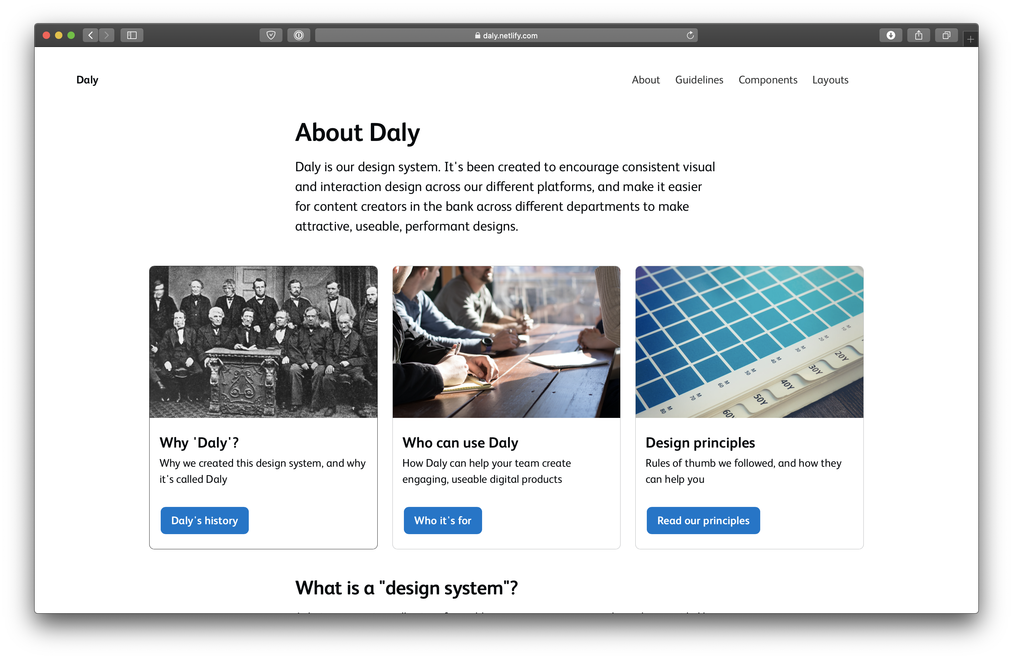
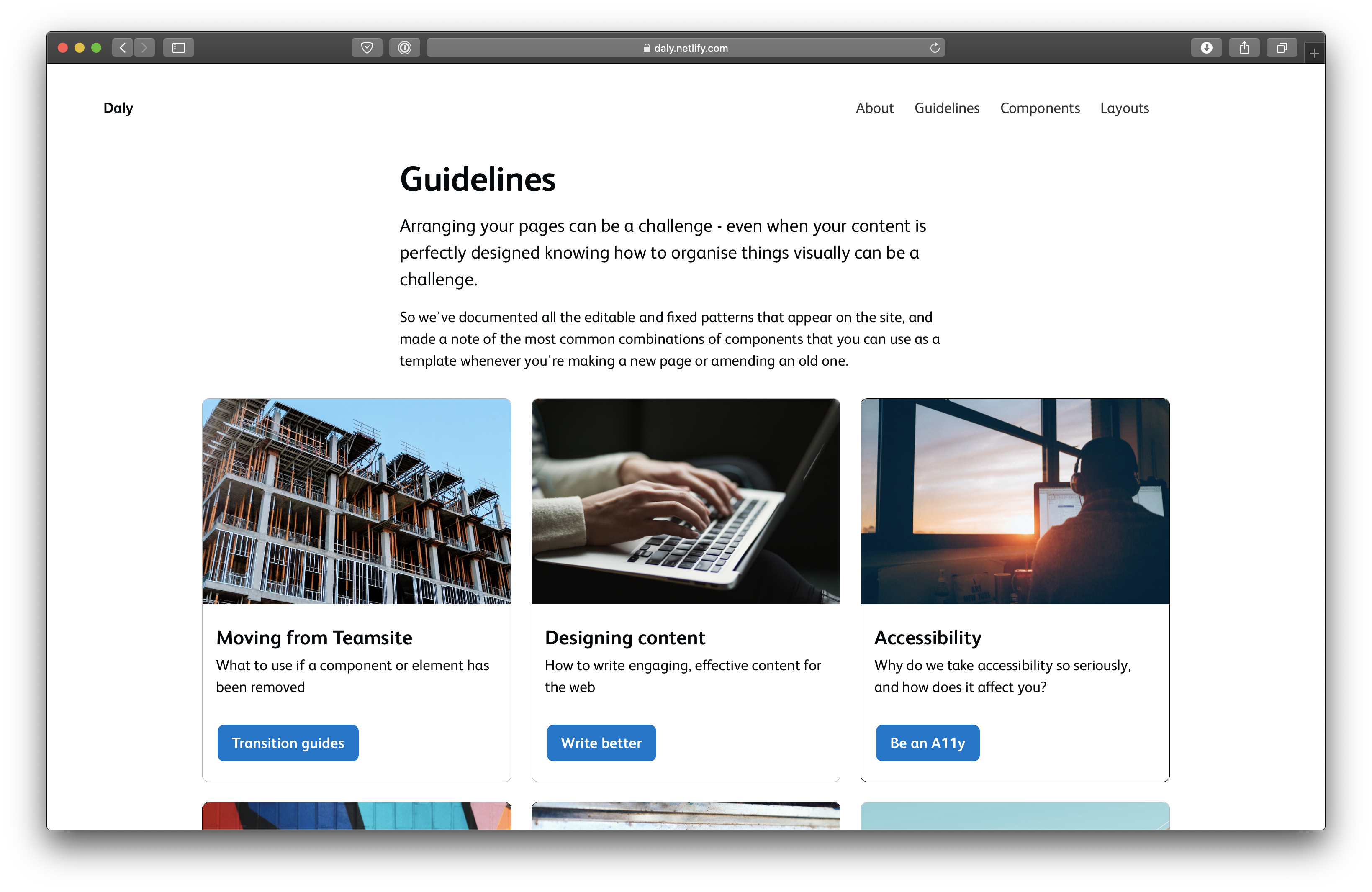
Daly is the design system for the Co-operative Bank. I named it after James Daly, a joiner who built the first ever co-operative business out of recycled materials.
Alongside product owners, content designers and developers, I led on the formalisation of a new design language centred on accessibility, cross-platform user and colleague feedback, and an incredibly short deadline.
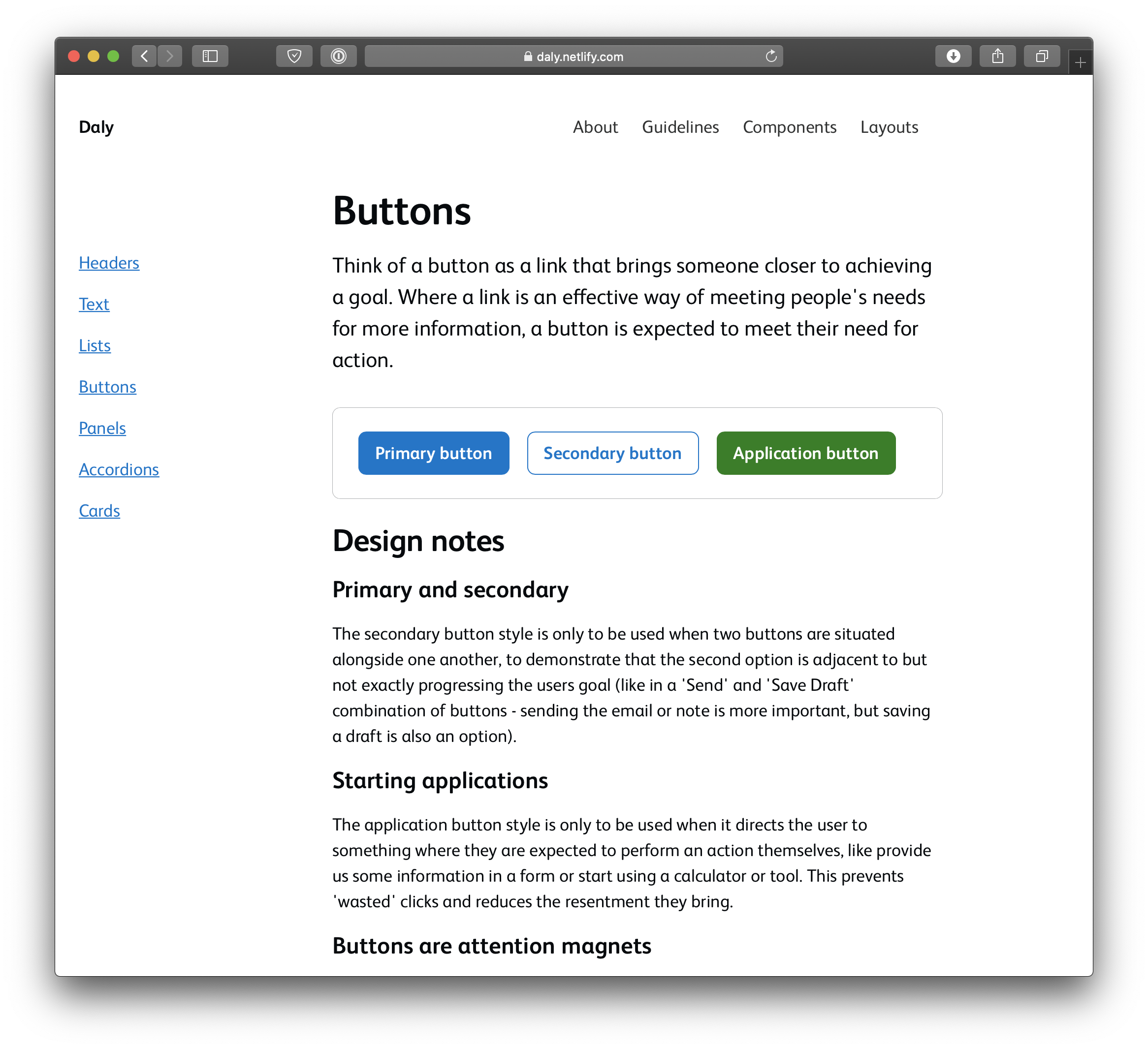
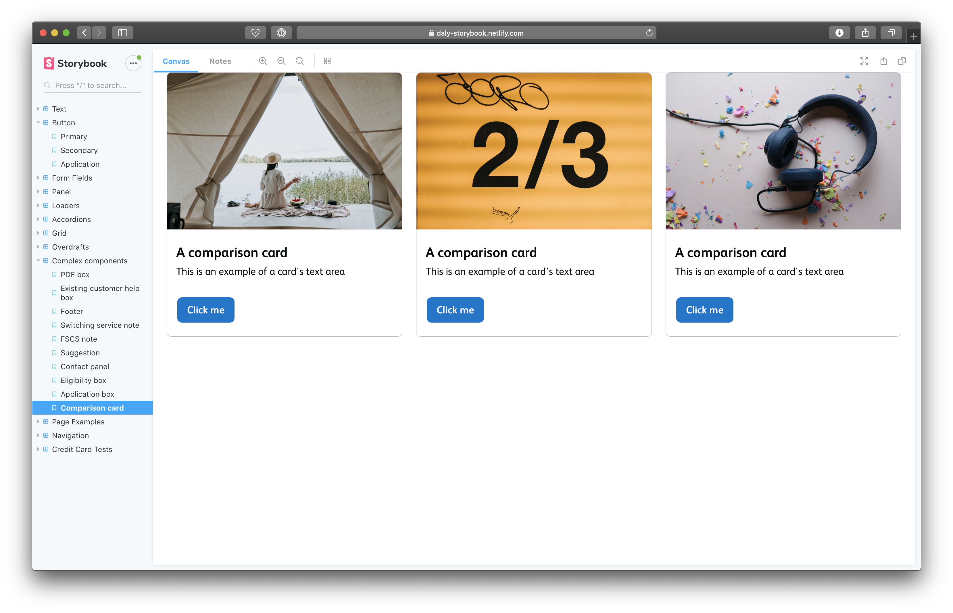
This included the creation of a brand new component-based UX library incorporating industry best-practice as well as internal lessons, an extensive series of internal guides on transitioning to new components, and the redesign of dozens of key pages.
Highlight #1
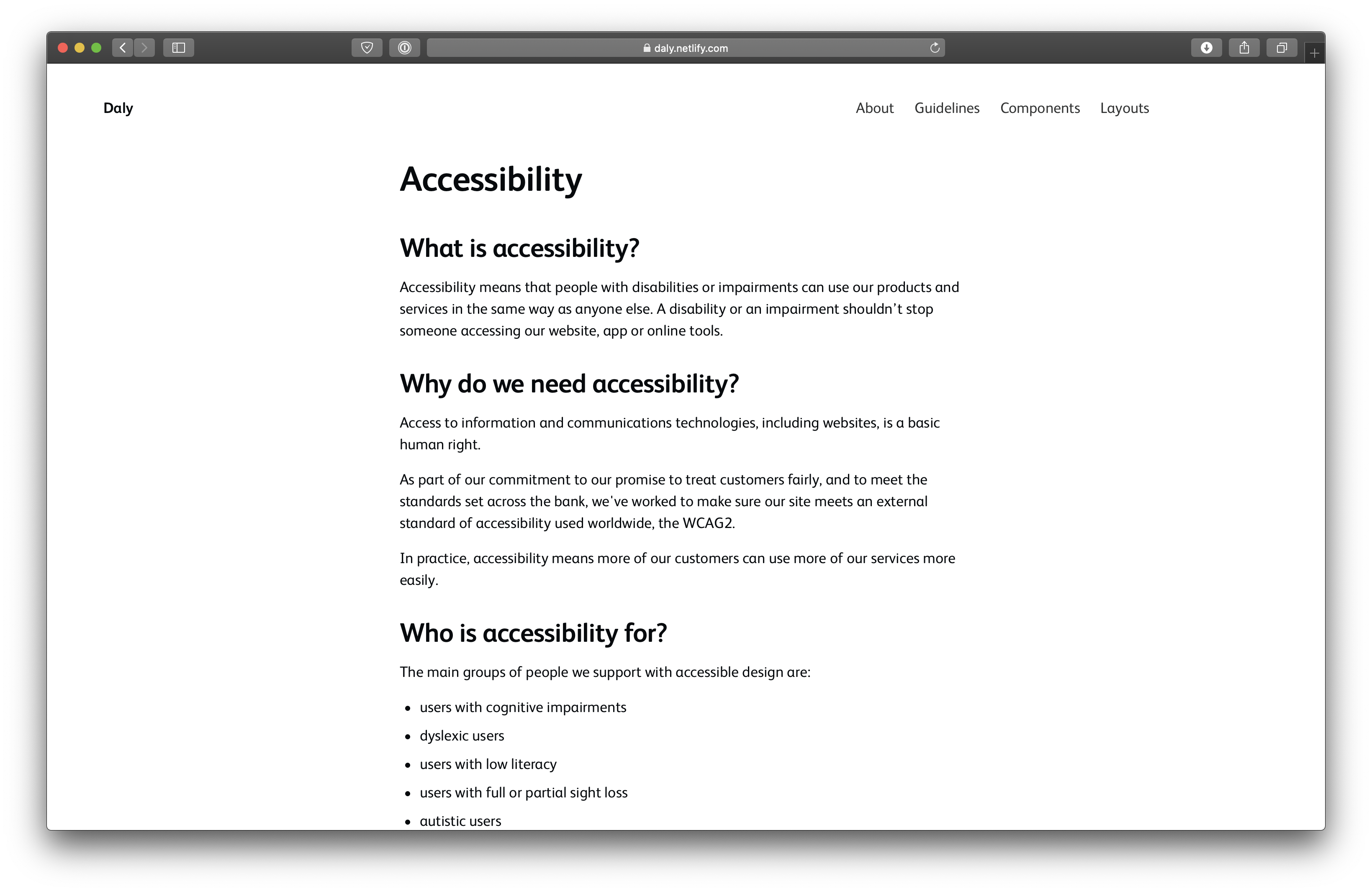
Accessibility
In financial services, accessibility standards are often an afterthought, despite a high average customer age and the necessity of banking services for everyone.
It was imperative that our components, patterns and guidelines took accessibility into consideration at every step. As well as an obvious focus on colour contrast and typographic scale, we wrote significant guidance on how to write accessible content, how to select accessible imagery.
Highlight #2
Feedback
Given the huge array of stakeholders and customers, getting feedback from users on individual and gestalt elements of the system was important - both in terms of how bank customers found the new designs by comparison with old designs, and how bank colleagues found the system to use to create and maintain web pages.
As well as remote and in-person user testing facilitated by colleagues, I organised demos of new components, templates and patterns to introduce content executives and POs to new standards and interactions, and explain why each decision was taken.
The result wasn't only an increased interest, but also tangible changes and improvements to the system - the involvement of the regulatory and product risk departments in writing page creation guidelines means a much quicker approval process for new content.
Highlight #3
Speed
The Daly project began as a response to an urgent and immediate need - our hosting provider was shuttering our service within six months. This meant we needed a release-ready candidate as soon as possible, limiting initial research time.
Within a few weeks I and colleagues in design organised and facilitated day-long workshops to map and prioritise what components already existed, where and by whom they were used, and which needed the most work to replace or redesign.
By month two I'd created a component library with ReactJS, the styled-components library and Storybook, using a token system to pull in styling and formatting data.
The result is an extensible and maintainable system of componentised designs able to be used across different platforms and services with ease.