Dominic White
Service and User Experience Designer
Kitty
Interface design
User research
Content design
Art direction
Figma
Context
Smile was the first-ever internet bank in the UK, launching in 1999.
Since the millenium traditional banks have caught up, and global financial deregulation has meant challenger banks can emerge and pocket 3 million current account customers in 24 months.
That deregulation (along with some genuinely quite funny mismanagement) also almost collapsed Smile and the Co-operative Bank, which led to a huge hesitancy in testing new products on the open market.
That deregulation also almost collapsed Smile and the Co-operative Bank, which led to a huge hesitancy in testing new products on the open market.
As a result Smile's initial core business (younger people not drawn to the Co-operative Bank's ethical credentials and not needing a broad suite of connected savings and credit products) were drawn elsewhere; those still interested were put off by 20-year-old application forms.
Problem
How to match existing regulatory requirements and legacy back-end systems to the needs of younger customers used to Monzo, Revolut and Starling?
Response
Workshops with university students to create new product ideas, quick design sprints to test new concepts, iterative testing and collaboration with developers to find the limits of our legacy mainframe system.
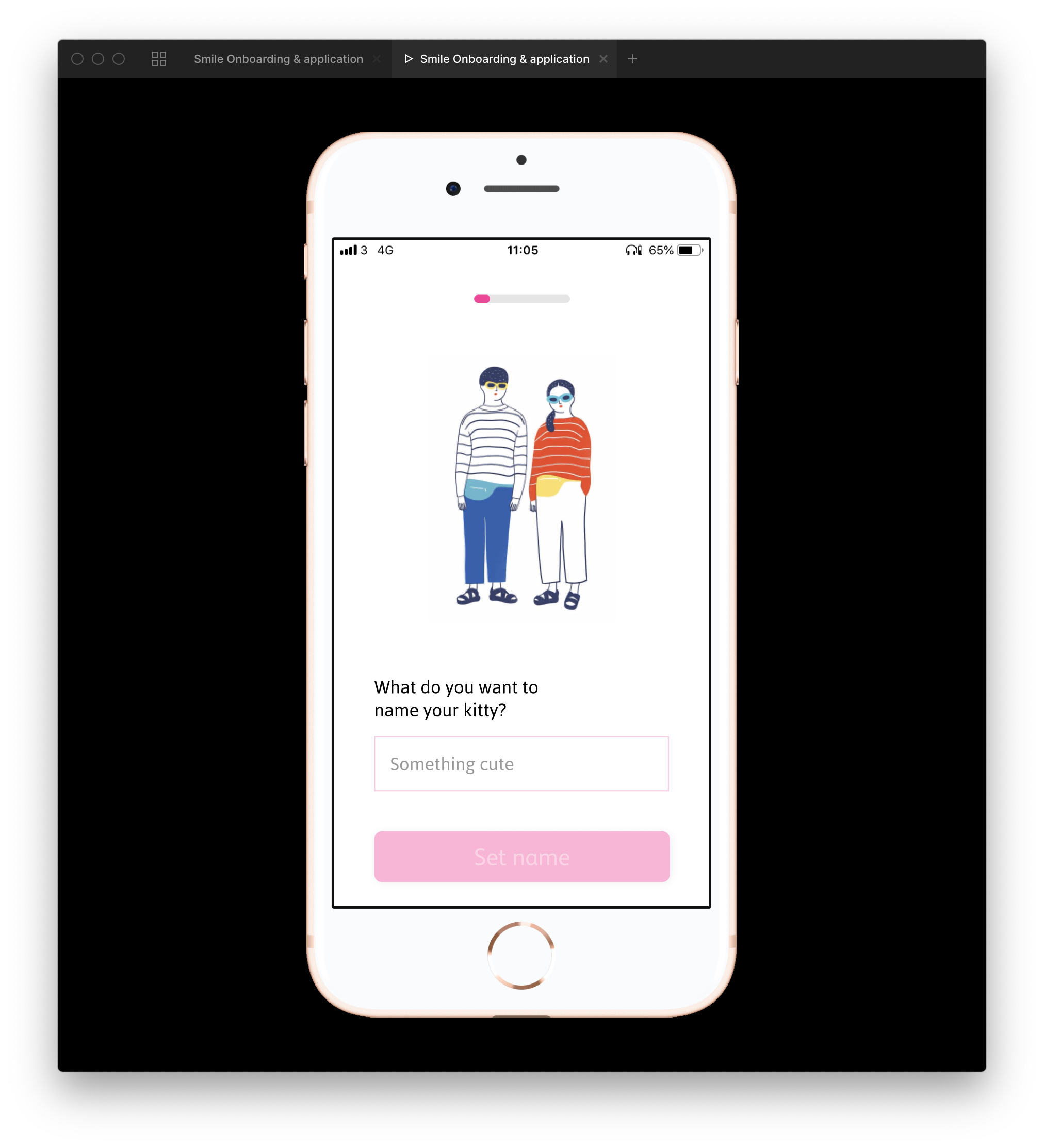
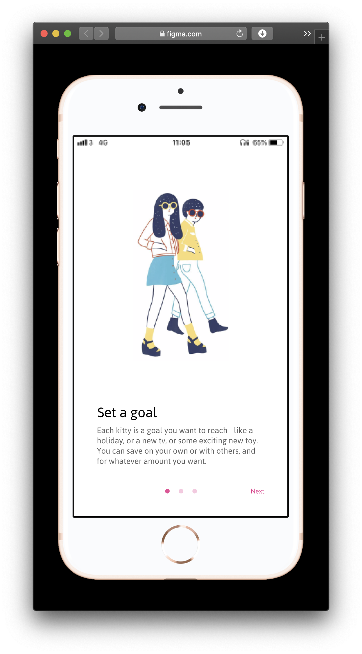
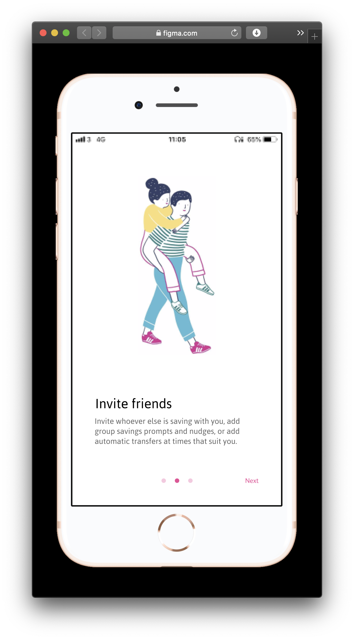
Working with students from Salford University and Manchester Metropolitan University, and with research provided by students from Hyper Island, we created Smile Kitty - a group savings product that makes it easier to save together for holidays, gifts, bills, or whatever you need.
Each phase began as a paper prototype, created and tested by students, and developed iteratively from each round of testing on real Smile customers, followed by conversations with back-end engineers, risk analysts and key stakeholders from across the bank.
As a result the onboarding and application forms teams are completely redesigning their strategy from Q1 2020, building in the learning we've taken from this process.
Highlight #1
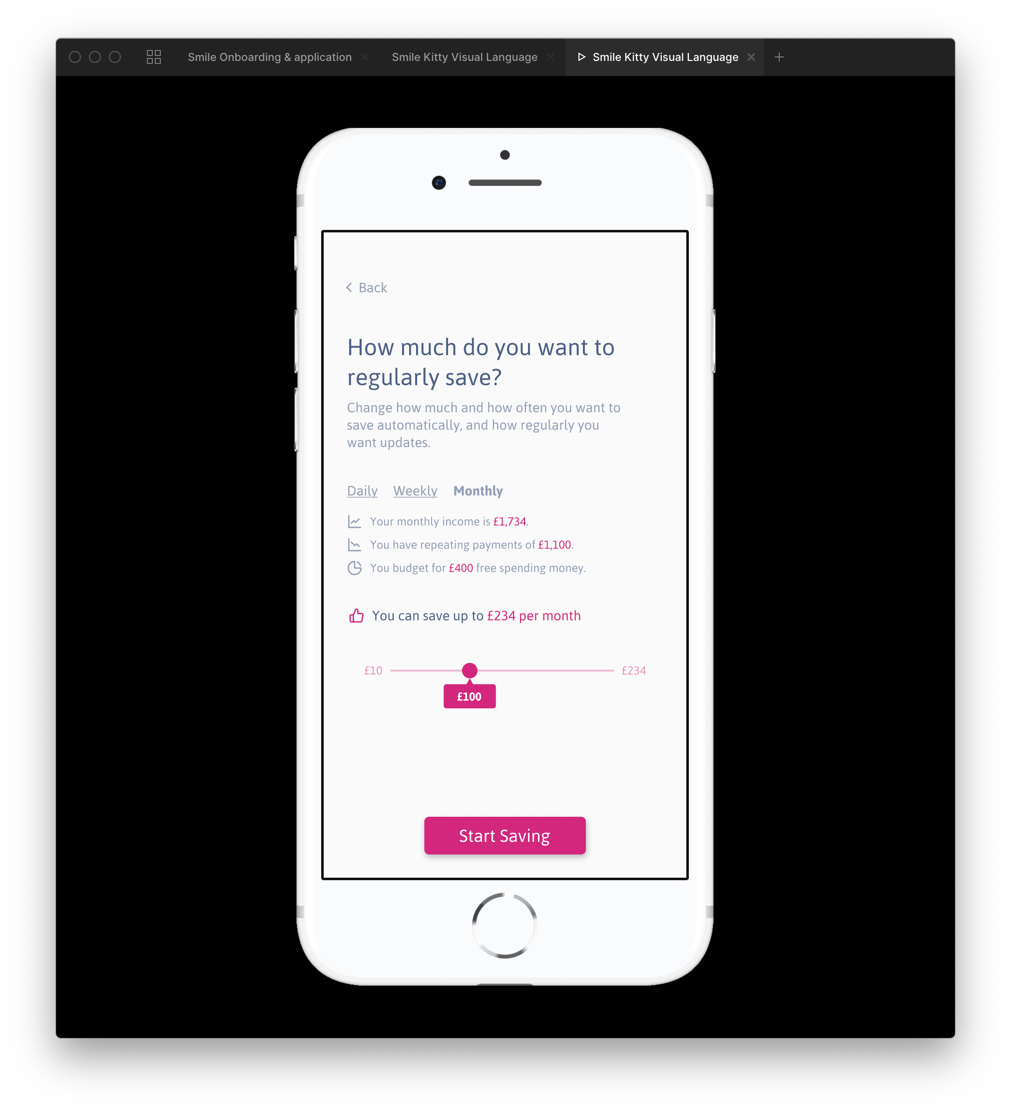
Doing the maths
People don't typically enjoy doing mathematics - even less so when that mathematics is relating to their bank balance. The maths only gets more complex when your income is uncertain (as on a zero-hours contract) or arrives in a block (as in a student loan).
Who would have thought people would respond well to an application that can intuit how much you can afford to save each day, week or month, but still gives you control of what you save?
Highlight #2
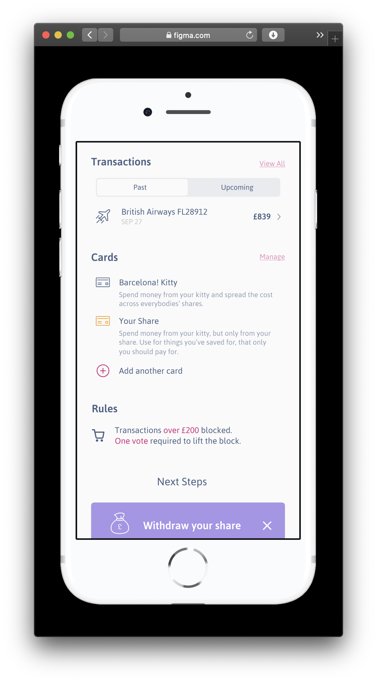
Save alone, together.
One of my own assumptions in this process was that the saving was the hard part - convincing people to put their money in the control of a single person would be the challenge.
As we tested the paper prototypes, and the more detailed Figma prototypes, we found that the opposite was true - people were more than happy to save with their pals and trusted them implicitly to look after their money.
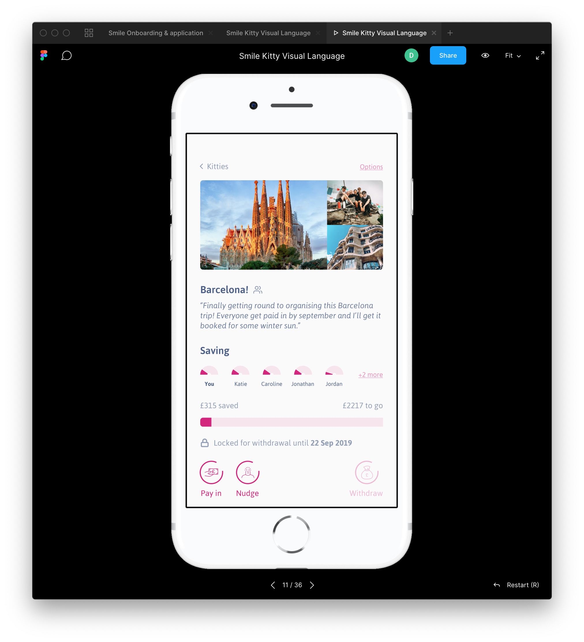
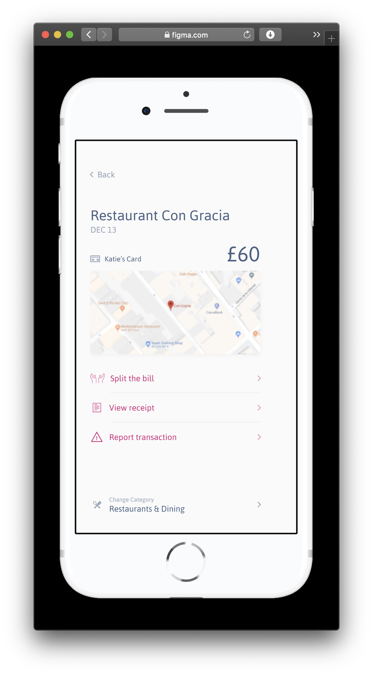
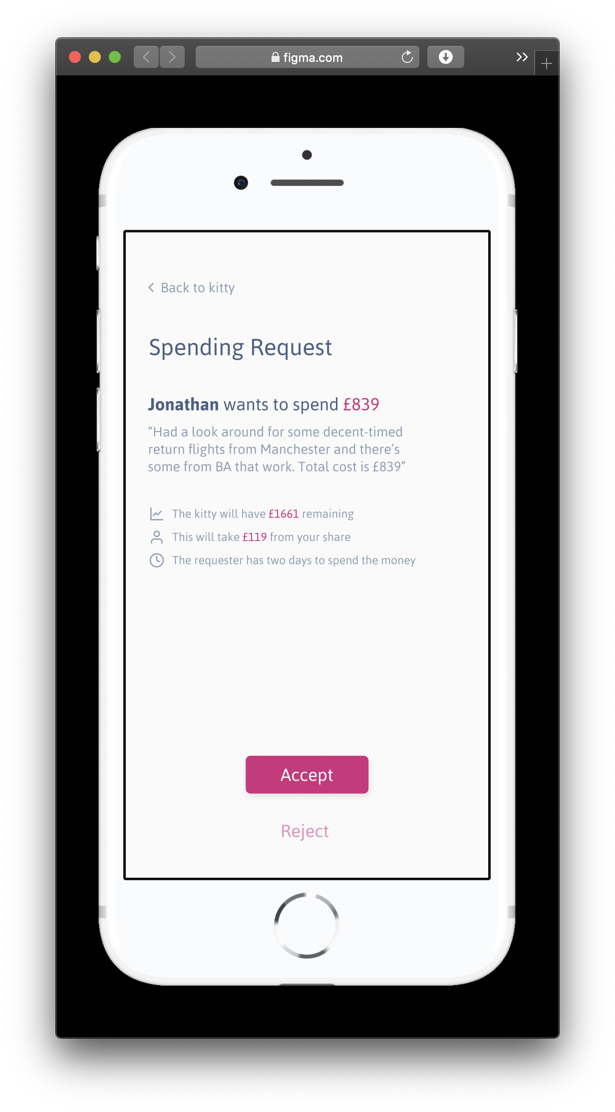
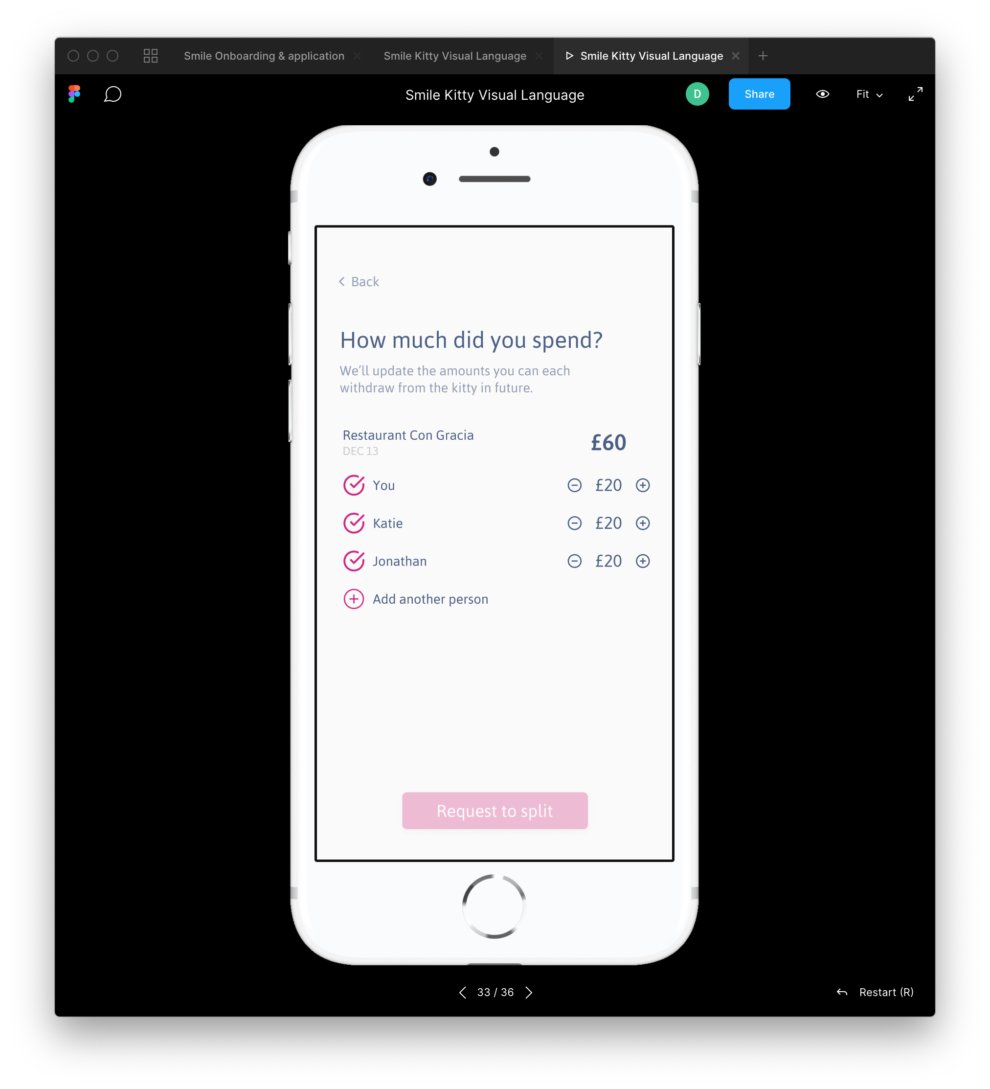
There were conditions, though - our testers wanted to know who'd saved what, who had spent what, and what each person's fair share was after all the spending had been done. My initial assumption that people would be happy to share out whatever remained in the kitty after the big spends, and was totally wrong.
This meant testing bill-splitting and managing individual contributions and top-ups.
Highlight #3
Optimistic Thievery
More than ever traditional branding elements are important differentiators in financial services.
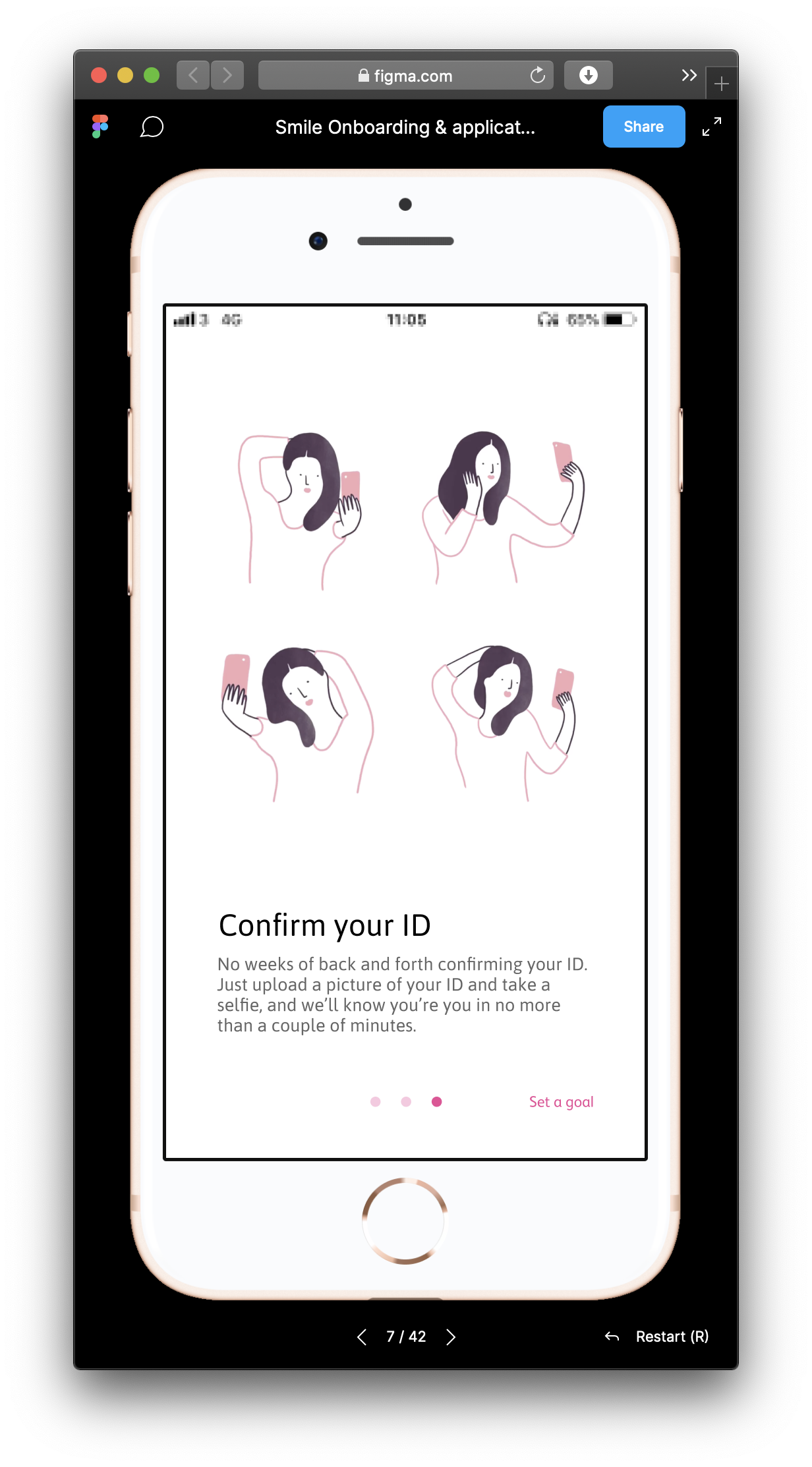
Given that the Smile brand hasn't changed significantly in nearly two decades, it seemed a good time to experiment with new and expanded colour palettes and visual languages.
Core to this was illustration, a popular and accessible format to provide differential cues - but given the tight timeframe and zero budget we couldn't find an illustrator in time or for free.
So I stole some from the instagram of Agathe Sorlet, who is amazing.
If it ever went beyond internal proof-of-concept phase, we'd hire an illustrator.